Below is a collection of bugs, inconsistencies, and problems with Cursor app on iOS. The list has no particular order. I tested version “V1.6.1 (39021)” on iOS 27 Beta 5.
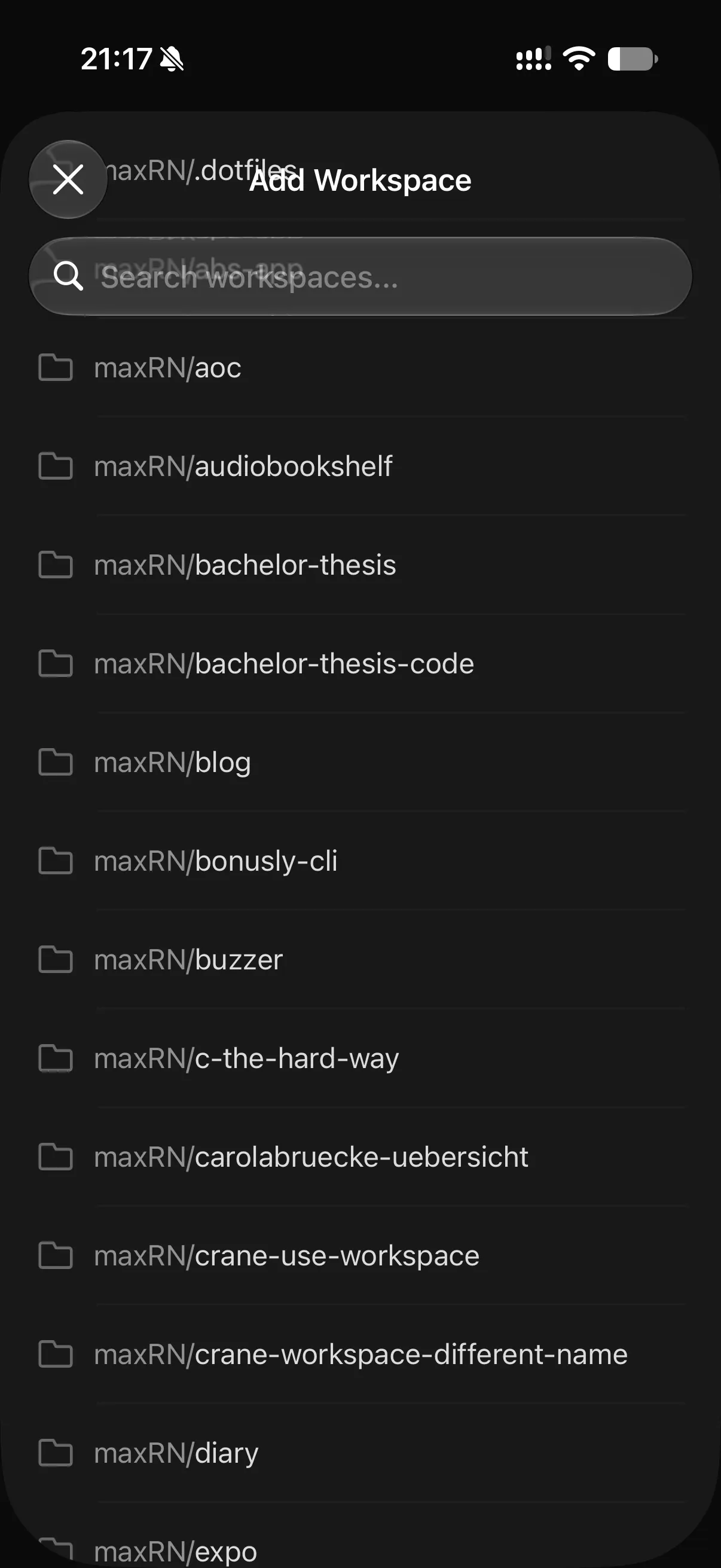
Add workspace: missing header blur
The header is missing blur, making the content behind it hard to read and it also makes the header area visually distracting.
Add workspace: Add Repositories
The “Add Repositories” button is on the footer of the list. This is bad, because it makes the button hard to discover and it’s also annoying to have to scroll down all the way to the bottom.
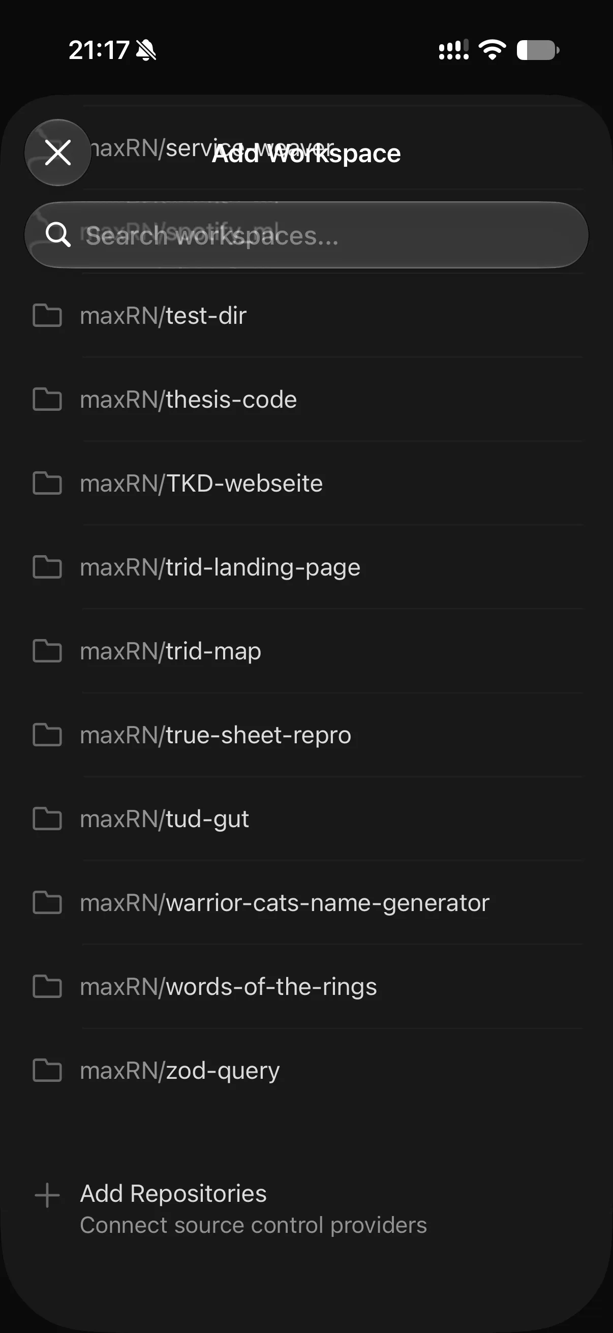
Instead it should be a “plus” header button or be part of the list header.
Integrations page: web view + text too small
This seems to be just a WebView, which isn’t bad per se, but it’s still jarring, because it doesn’t feel native. The problem here is the font size for the section headers being too small.

Profile page: layout jump
No matter how many times you open the Profile page, there is a layout jump after a few moments.
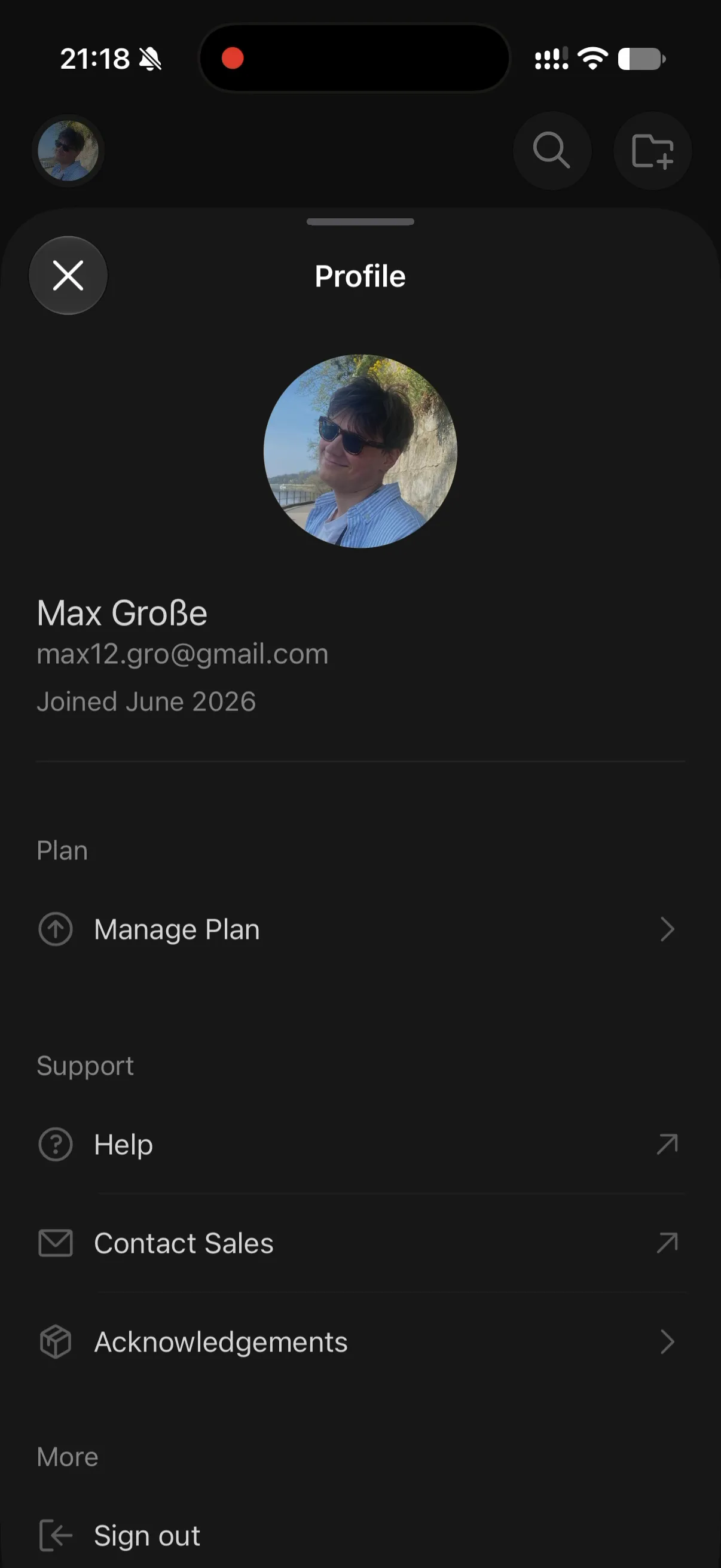

Solution is to either cache the data (for the graphs) or show a loading indicator.
Profile page: sheet grabber
The grabber at the top of the sheet is unnecessary and it’s also is not used on any other sheet in the app.

Profile page: share button
The share button in the header is using the wrong icon.
It should use the standard iOS share icon, SF Symbol name: square.and.arrow.up.
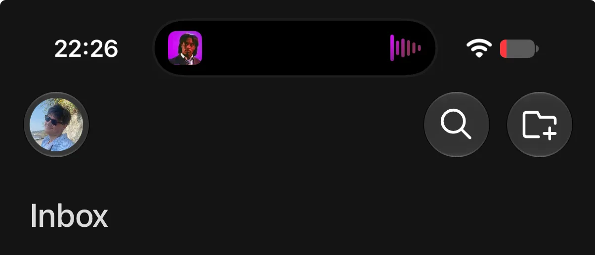
Home screen: profile icon in toolbar
The profile avatar is wrapped in Liquid Glass. Apple recommends not do that, for example in this talk at 09:08. However even Apple can’t seem to get it right in their own apps. In Health it’s done correctly, but in Podcasts the avatar also has a glass border.


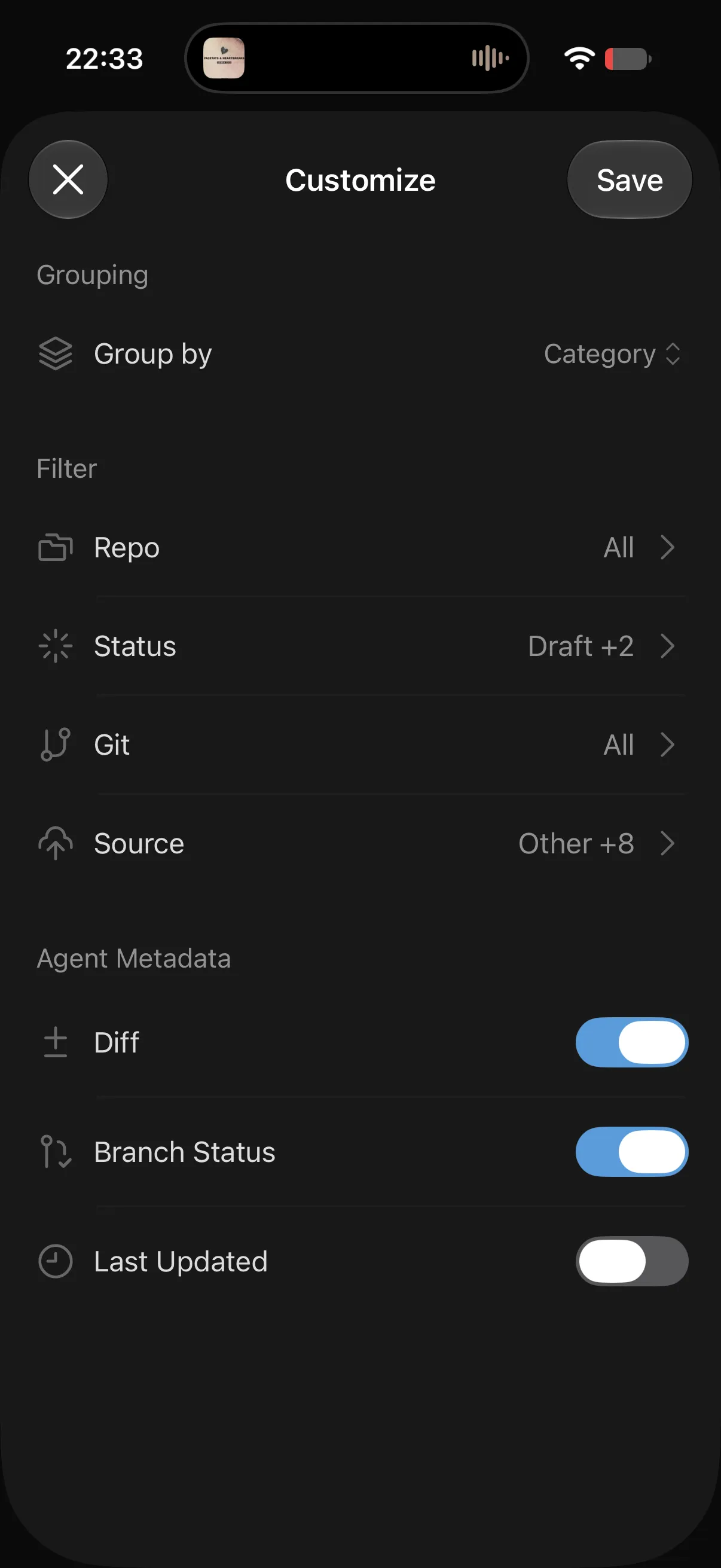
Filter page: Save button not looking “primary”
I’m not sure how to describe this, but the Save button on the filter sheet doesn’t look like a primary button. It has the same styling as the “X” close button and seems easy to miss.
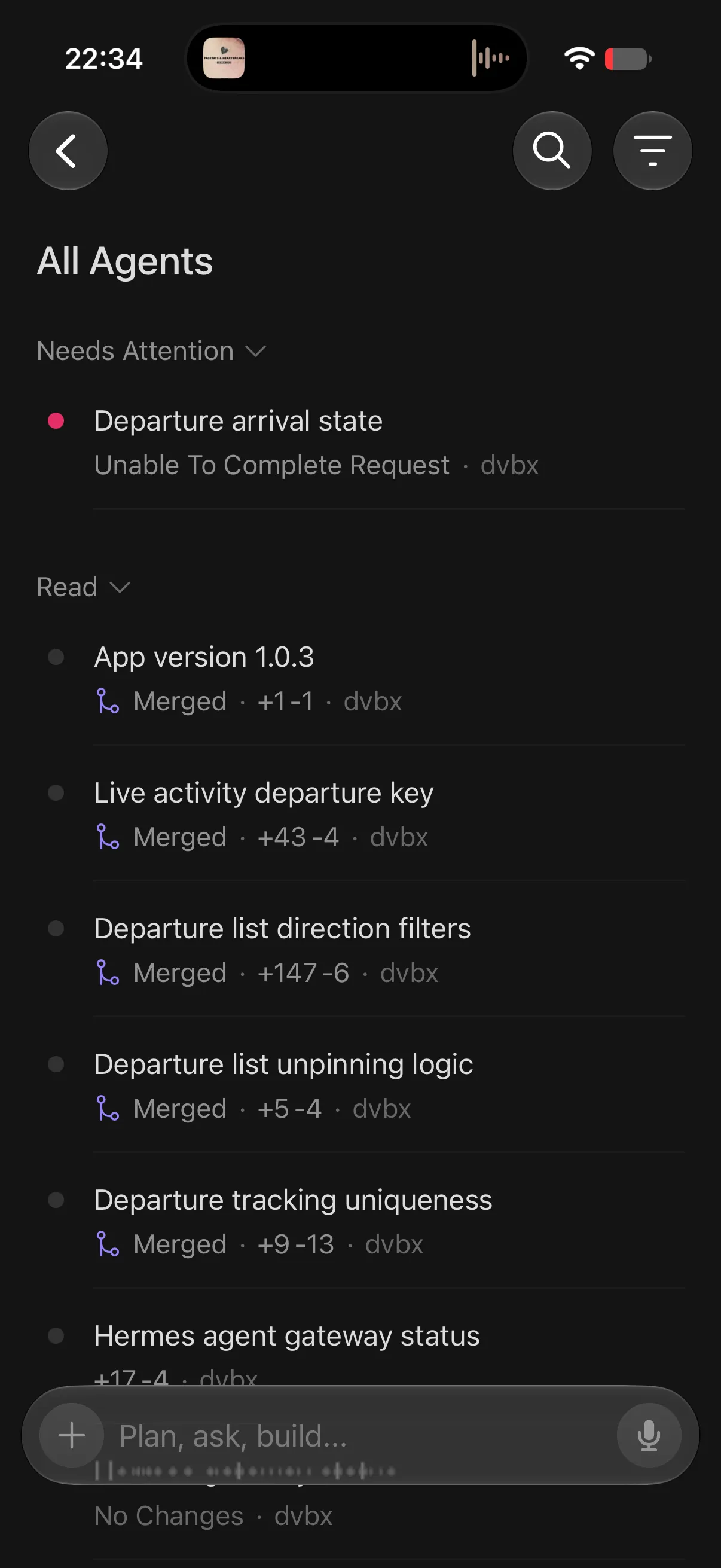
Filter page: not showing active filters
After having applied a filter the Agent page doesn’t indicate anywhere that a filter is active.
Solution could be similar to how GitHub does filtering in their app: